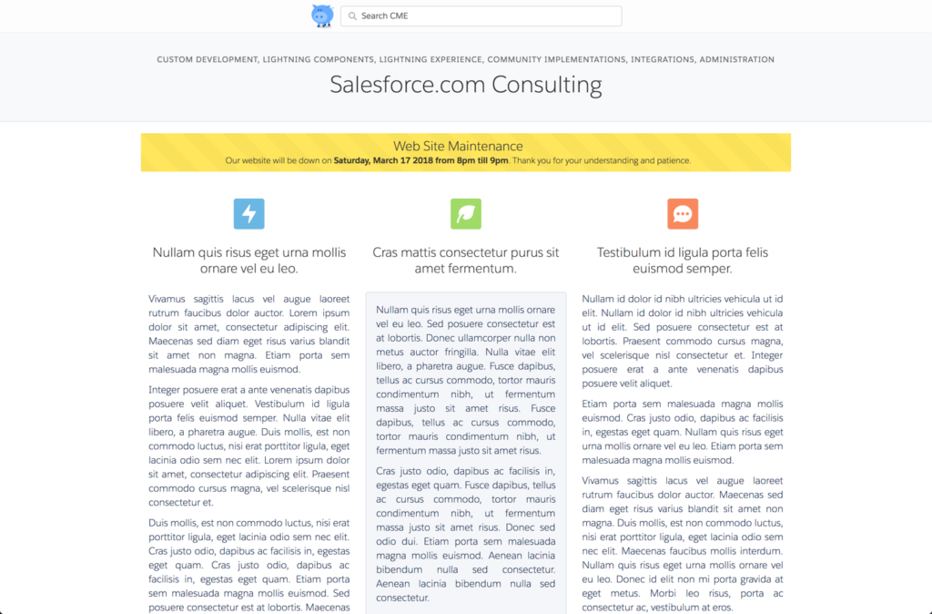
The request from the client was pretty straightforward. We were implementing a public knowledge base – using the Customer Service template – and the client requested the ability to display notifications to visitors. Announce downtime for maintenance; callout new features; announce online events; are all examples of possible alerts.
For more details on the requirements and how it was built view this post. This post will focus on how to use the Community Alerts component once it is installed.
Add the component
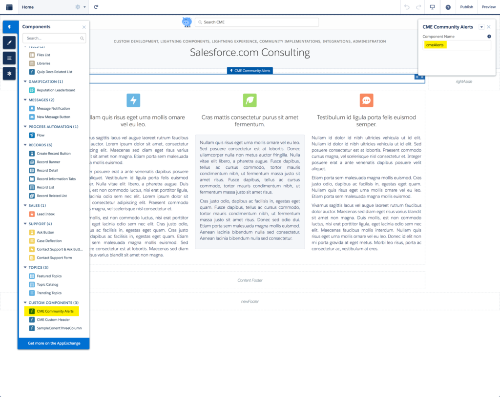
The first step is adding the component to a community. When adding the component consider where you want the alerts to appear:
- If you want the alerts to appear on every page add the component to the header.
- If you only want the alerts to appear on a single page – like the homepage – then add the component to the content area of that page.
The alerts component can be added multiple times to a single community. For example, you may want downtime alerts to appear on every page, but on the homepage, you also might want to display callout type alerts.
Finally, you will need to give the component a name – this is the only attribute you will need to set. The name of the component will be used to associated alert records with a specific component. In this example “cmeAlerts” is the name we are using.
Publish your changes.
 Adding Alerts
Community Alerts is a custom object. Go to the Community Alerts tab and click New to add an alert record. Enter the following data:
| Community Alerts Name | This is the title/header that will appear on the alert. |
| Component Name | The component name is used to determine in which instance of the Community Alerts component this alert will appear. To match our example “cmeAlerts” would be used. |
| Details | This is the text that will appear on the alert. NOTE: HTML can be used to style and format the text. |
| Expiration Date | The last day that the alert will appear in the community. |
| Language | If your community has been translated into other languages make sure those languages have been added to this picklist. If you want the Alert to appear in the viewer’s language then an additional alert record will need to be added for each alert. |
| Start Date | The first day that the alert will appear in the community. |
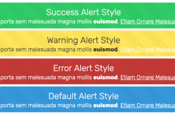
| Type | The type field determines the color of the alert: default = blue, success = green, error = red, and warning = yellow. |
We hope you find this component helpful and please contact us if you have any feedback.
