This is Part 2 of a series on using the CMEDataGrid. If you haven’t checked out Part 1 yet, you might want to do that first as it lays the foundation for displaying data in the grid. In this installment, we pick up where we left off and show you how to configure the grid to enable acting on the data.
If you want to work alongside the article, you can download the source code from the Consulting Maine GitHub repository. The Demo app is included in the repository in case you run into trouble or just want to step through the working code [ConsultingME/CMEDataGrid].
There are 3 built-in column types that render an interface to take action on a row of data:
| Column Type | Description |
| ActionGroup | Renders a set of actions in a row. Actions can be either a button or an icon. |
| ActionMenu | Renders a set of actions in a dropdown menu. Actions are rendered as a label and icon. |
| ActionText | Renders a text hyperlink |
ActionGroup
Let’s imagine you need to allow your users to approve or deny the opportunities displayed in your grid. We can render a green check for the approval action, and, just to show the option, the text “Deny” for the denial action. Add the following code to your columns array:
|
1 2 3 4 |
{Label: 'Approval', Type: 'ActionGroup', ActionList: [ {IconName: 'utility:check', Variant: 'bare', AlternativeText: 'Approve', Name: 'Approve', ButtonClass: 'green', Size: 'large', Title: 'Approve'}, {Label: 'Deny', Name: 'Deny'} ]} |
You’ll notice the ActionList property is an array containing an object for each action. If you don’t include an IconName property in the Action object, the output will be an HTML button. Check the documentation available on GitHub for the full list of available properties for an Action object.
We’ll also need to implement the CSS for the “green” style so add the following to the Demo style file:
|
1 2 3 |
.THIS .green { color: green; } |
When you reload your demo app, you should see the following:
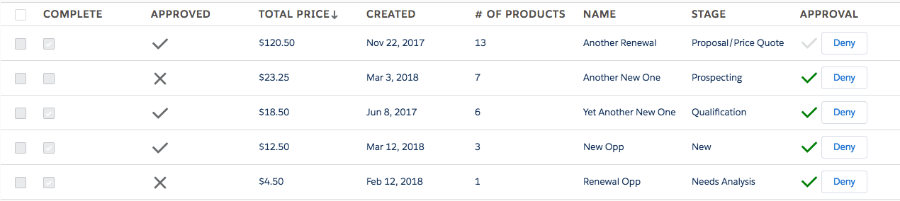
Data grid with ActionGroup
ActionMenu
Now let’s imagine your users may need to take additional actions on these opportunities. Maybe they need to Clone, Follow, or Change Owner. Let’s add those actions to an ActionMenu. Add the following code to your columns array to create an Actions column:
|
1 2 3 4 5 |
{Label: 'Actions', Type: 'ActionMenu', ActionList: [ {Label: 'Clone', IconName: 'utility:copy', Variant: 'bare', AlternativeText: 'Clone', Name: 'Clone', Size: 'large'}, {Label: 'Follow', IconName: 'utility:add', Variant: 'bare', AlternativeText: 'Follow', Name: 'Follow', Size: 'large'}, {Label: 'Change Owner', IconName: 'utility:change_owner', Variant: 'bare', AlternativeText: 'Change Owner', Name: 'ChangeOwner', Size: 'large'} ]} |
Now you should see the new Actions column:
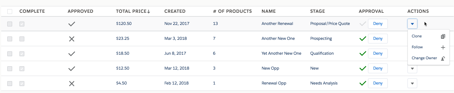
Data grid with the action menu
You can also create an ActionText column which just renders as a hyperlink but with all these fancy options, why would you want to?!
Handling Grid Actions
So now that you have all these fancy action triggers, you’re probably wondering how to hook into them so you can actually DO something! All of the grid actions fire the same event, so it’s as easy as creating an event handler for the CMEDataGridActionFired event. Just add the following markup to your demo component:
|
1 |
<aura:handler name="ActionFired" event="c:CMEDataGridActionFired" action="{!c.onGridAction}"/> |
Now whenever any action is triggered, your onGridAction controller method will be executed. The event has two parameters:
| Parameter Name | Description |
| Action | The Name of the Action that was triggered by the column configuration |
| SelectedRow | The row of data on which the action was triggered |
So now let’s add some code to the controller to pop up an alert with the Action and the Name field from the SelectedRow:
|
1 2 3 4 |
onGridAction: function(component, event, helper) { const params = event.getParams(); alert('Action: ' + params.Action + '\r\n' + 'Name: ' + params.SelectedRow.Name); } |
In a real-world implementation, you’d probably want to switch (params.Action) and call the different helper methods that implement your action functionality.
Action Validation
“But wait,” you say! “I only want them to be able to approve an opportunity if the total value is under $100.” Ok, no problem. We’ll add a DisabledValidator to the Approve action. A DisabledValidator is a function that gets executed for each row. The function will be passed the row of data and must return an object with two properties:
| Name | Type | Description |
| Disabled | Boolean | Whether the action should be disabled or not |
| Message | String | Message describing why the action is disabled |
So let’s write the function that will determine whether the Approve action should be disabled for each row. Add the following to your demo component helper:
|
1 2 3 4 5 6 7 8 |
validateApproved : function(datarow) { var result = {Disabled: false, Message: null}; if (datarow.TotalPrice > 100) { result.Disabled = true; result.Message = "Opps over $100 must be approved some other way."; } return result; } |
Then update the action in the ActionGroup with a DisabledValidator property:
|
1 |
{IconName: 'utility:check', Variant: 'bare', AlternativeText: 'Approve', Name: 'Approve', ButtonClass: 'green', Size: 'large', Title: 'Approve', DisabledValidator: helper.validateApproved} |
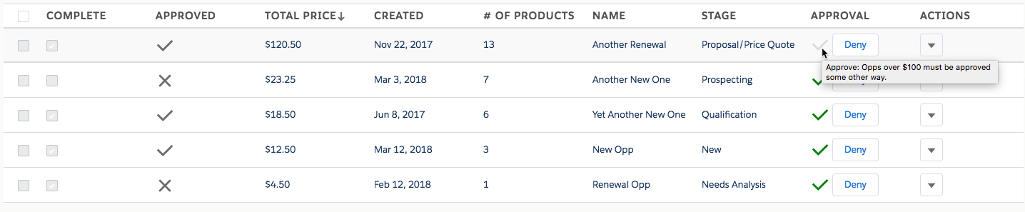
Data grid with mouseover validation
Selecting Rows
If the built-in Action types don’t support your UI design or if you need to act on multiple rows, the grid has a “selectedrows” attribute you can use. To enable it just set the selectAll attribute on the grid. Let’s also add a button to our demo component to simulate your custom action:
|
1 2 3 4 5 6 |
<c:CMEDataGrid columns="{!v.columns}" datarows="{!v.datarows}" sortBy="TotalPrice" sortAsc="false" aura:id="grid" selectAll="true" /> <lightning:button label="Fire Custom Action" onclick="{!c.onCustomAction}" /> |
The default is to allow multiple rows to be selected but you can disable that by setting the multiSelect attribute to false.
For now, we’ll just have our controller action log the selectedrows to the browser developer tools console:
|
1 2 3 4 |
onCustomAction: function(component, event, helper) { const grid = component.find("grid"); console.log(grid.get("v.selectedrows")); } |
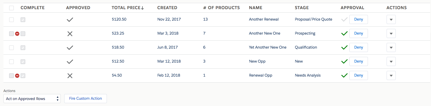
Selection Validation
But wait, you have multiple custom actions and each action has unique logic to validate whether it can be taken on a specific row, don’t you? OK, no problem. The grid exposes a method called updateSelectable() that is used to enable/disable the select boxes. Just pass in a list of objects with the following schema:
| Property Name | Description |
| PrimaryKey | The value of the property identified as the primary key. The name of this field needs to be passed to the grid using the primaryKey attribute. |
| Selectable | Boolean indicating whether the row should be selectable or not. |
| Error | Text that will be displayed on hover over the disabled icon. If no Error text is set, the disabled icon will not be displayed. This can be used to initialize or reset all rows. |
The first thing we need to do is tell the grid which property in our dataset is the primary key of the rows. In our case, we have a field called Id with a unique identifier per row. Add the primaryKey attribute to the data grid markup:
|
1 2 3 4 5 |
<c:CMEDataGrid columns="{!v.columns}" datarows="{!v.datarows}" sortBy="TotalPrice" sortAsc="false" aura:id="grid" selectAll="true" primaryKey="Id" /> |
Now let’s add a dropdown with a couple of actions users can take. Add this markup between the grid and the Fire Custom Action button we added above:
|
1 2 3 4 5 |
<lightning:select label="Actions" onchange="{!c.onActionSelected}" class="actionSelect"> <option value="">Select One</option> <option value="ApprovedAction">Act on Approved Rows</option> <option value="Archive">Archive IncompleteRecords</option> </lightning:select> |
Let’s set the width of the dropdown so it doesn’t stretch across the entire screen. Add the following css to your style file:
|
1 2 3 |
.THIS .actionSelect { width: 200px; } |
Now we need to implement the custom validation logic. If the user selects the “Act on Approved Rows” option, we need to disable all the rows that are not approved. Similarly, if they choose the “Archive Incomplete Records” action, only incomplete records should be selectable. Here’s how we do it:
|
1 2 3 4 5 6 7 8 9 10 11 12 13 14 15 16 17 18 19 20 21 22 23 24 25 26 27 28 29 30 31 32 33 |
onActionSelected: function(component, event, helper) { const actions = component.find("actions"); const data = component.get("v.datarows"); var evaluator; switch(actions.get("v.value")) { case "ApprovedAction" : evaluator = function(dr) { var obj = {PrimaryKey: dr.Id, Selectable: dr.IsApproved === true}; if (obj.Selectable === false) obj.Error = "Unapproved rows cannot be selected"; return obj ; } break; case "Archive" : evaluator = function(dr) { var obj = {PrimaryKey: dr.Id, Selectable: dr.IsComplete === false}; if (obj.Selectable === false) obj.Error = "Complete rows cannot be selected"; return obj ; } break; default : evaluator = function(dr) { return {PrimaryKey: dr.Id, Selectable: false}; } break; } const selectable = data.map(evaluator); const grid = component.find("grid"); grid.updateSelectable(selectable); } |
So what’s happening here? Based on which action is taken – the value of the lightning:select component – we’re creating a different function that evaluates the row and returns the object we need to pass to the updateSelectable() method. Then we run the map() method on our list of data, passing it the appropriate function. We then call updateSelectable() on the grid passing it our new selectable list.
When you select “Act on Approved Rows” you should see:
Data grid with validation
Conclusion
As you can see, the CMEDataGrid offers a few built-in options for acting on the data, including ActionGroup and ActionMenu. If those options don’t fit your situation you can always use the selection functionality with your own action interface.
Stay tuned for Part 3 in our series on User Interface options with the grid. We’ll talk about filtering, paging, and using facets to integrate the grid into your design.