Introduction
One of the most common scenarios in Salesforce development, and application development in general, is the requirement to display a set of data and provide tools for working with that data. Probably the most common mechanism for implementing that requirement is the use of a data grid or data table. Given this recurring need, we developed our own data grid that we can reuse across multiple implementations.
This article is Part 1 of a walk-through of using the CMEDataGrid to display some data and act on it. In this installment, we build a basic implementation of the grid to just display some data in a grid. Part 2 will dive into how to act on the data, and Part 3 will get into some of the advanced layout options available.
CME Data Grid
We all know that Salesforce provides a fairly rich set of components for us to use in developing our applications, so you might be wondering why we choose to develop our own component instead of using the standard lightning:datatable. The simple reason is that when we started developing this grid, the standard component was very basic. It didn’t support some of the features we all expect from a data grid. Salesforce has added additional features to lightning:datatable but we continue to use the custom data grid for two reasons. The first is that our custom data grid supports a more comprehensive set of features for integrating into any application. We’ll get into those options later in the tutorial. The second reason is since we have the source code we can continue to add features to the standard codebase or even fork it for specific implementations.
So let’s get to building our sample application. If you want to work alongside the article, you can download the source code from the Consulting Maine GitHub repository. The Demo app is included in the repository in case you run into trouble or just want to step through the working code [ConsultingME/CMEDataGrid].
Basic Implementation
The most basic implementation of the CMEDataGrid requires setting two attributes on the component: datarows and columns. Datarows is just your set of data in a javascript Array; columns is your meta-data. More on that below but for now let’s create a demo container component and attributes for the datarows and columns:
|
1 2 3 4 5 6 7 8 9 10 |
<aura:component> <aura:attribute name="datarows" type="List" /> <aura:attribute name="columns" type="List" /> <aura:handler name="init" value="{!this}" action="{!c.onInit}" /> <div class="slds"> <c:CMEDataGrid columns="{!v.columns}" datarows="{!v.datarows}" /> </div> </aura:component> |
Adding Rows
Typically, your data will be returned from an @AuraEnabled Apex controller method. For the sake of simplicity, let’s just load up a set of data manually when the container initializes. Add the following code to the demo component controller:
|
1 2 3 4 5 6 7 8 9 10 |
onInit : function(component, event, helper) { const demodata = [ {IsComplete: true, IsApproved: true, TotalPrice: 12.50, CreateDate: "2018-03-12T08:00:00-05:00", TotalProducts: 3, Id: 1, Name: "New Opp", StageName: 'New'}, {IsComplete: true, IsApproved: false, TotalPrice: 4.50, CreateDate: "2018-02-12T08:00:00-05:00", TotalProducts: 1, Id: 2, Name: "Renewal Opp", StageName: 'Needs Analysis'}, {IsComplete: false, IsApproved: false, TotalPrice: 23.25, CreateDate: "2018-03-03T08:00:00-05:00", TotalProducts: 7, Id: 3, Name: "Another New One", StageName: 'Prospecting'}, {IsComplete: true, IsApproved: true, TotalPrice: 120.50, CreateDate: "2017-11-22T08:00:00-05:00", TotalProducts: 13, Id: 4, Name: "Another Renewal", StageName: 'Proposal/Price Quote'}, {IsComplete: true, IsApproved: true, TotalPrice: 18.50, CreateDate: "2017-06-08T08:00:00-05:00", TotalProducts: 6, Id: 5, Name: "Yet Another New One", StageName: 'Qualification'}, ]; component.set("v.datarows", demodata); } |
Adding Columns
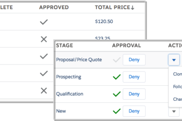
Now that we know what our data looks like, we can configure the columns of our grid. The grid supports a number of different column types:
- ActionGroup
- ActionMenu
- ActionText
- BooleanIcon
- Checkbox
- Currency
- Datetime
- Number
- SObjectLink
Don’t worry about the Action types right now; we’ll get to those in Part 2. Most of the others should be self-explanatory. IsApproved sounds like a good candidate for a BooleanIcon column, and just to show something different we’ll make IsComplete a checkbox. We’ll update our onInit function to include the code that sets the column config:
|
1 2 3 4 5 6 7 8 9 10 |
const columns = [ {PropertyName: 'IsComplete', Label: 'Complete', Type: 'Checkbox'}, {PropertyName: 'IsApproved', Label: 'Approved', Type: 'BooleanIcon', TrueIcon: {IconName: 'utility:check', Size: 'small'}, FalseIcon: {IconName: 'utility:close', Size: 'small'}}, {PropertyName: 'TotalPrice', Label: 'Total Price', Type: 'Currency'}, {PropertyName: 'CreateDate', Label: 'Created', Type: 'Datetime'}, {PropertyName: 'TotalProducts', Label: '# of Products', Type: 'Number'}, {PropertyName: 'Name', Label: 'Name'}, {PropertyName: 'StageName', Label: 'Stage'} ]; component.set("v.columns", columns); |
The grid includes documentation on all the column config object properties but I just want to note that the IconName is expecting the name of an icon from the Lightning Design System. That’s all we need to render a very basic grid. Let’s create a Lightning app to host our demo component so we can check it out:
|
1 2 3 |
<aura:application extends="force:slds"> <c:Demo/> </aura:application> |
Load up the demo app by navigating to https://<yourdomain>.lightning.force.com/c/demoapp.app and you should see:
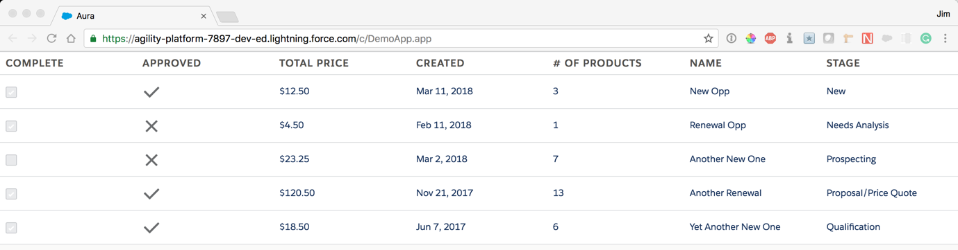
Example of a simple data grid.
Notice you can sort by clicking on any column header. We probably want to specify a default sort order and we can do that by setting the “sortBy” attribute to the name of the property we want to use for the default sort, and optionally the “sortAsc” attribute. Since we’re all about that cash, let’s have the default sort by Total Price desc. Update your component setting the sorting attributes as below:
|
1 2 3 |
<c:CMEDataGrid columns="{!v.columns}" datarows="{!v.datarows}" sortBy="TotalPrice" sortAsc="false" /> |
You should now see the default sorting applied:
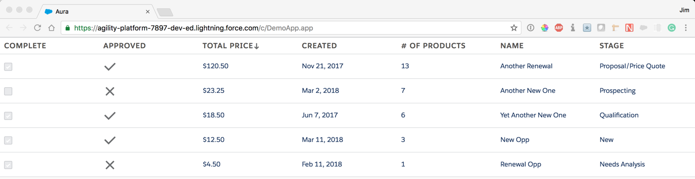
Data grid sorted by total price.
Congrats! You just completed a basic implementation of the CMEDataGrid!
Stay tuned for Part 2, CMEDataGrid Actions, and Part 3 CMEDataGrid Layout Options…